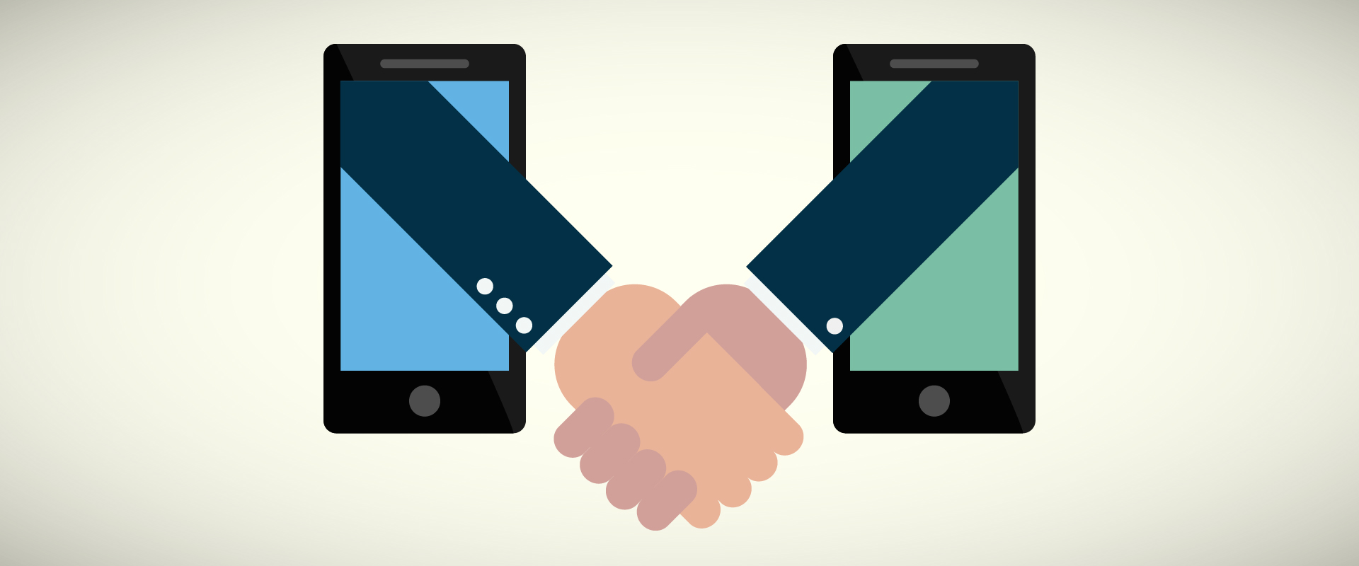
Websites customized for mobile devices
If you have any kind of online business, online advertising or communication with customers for sure you have already heard about the change in the Google algorithm and that new indexing will greatly affect the non-mobile-friendly websites. At the end of the April, Google has introduced some changes within their algorithm and decided slightly punish those who did not take care of the development of mobile-friendly versions of their sites.
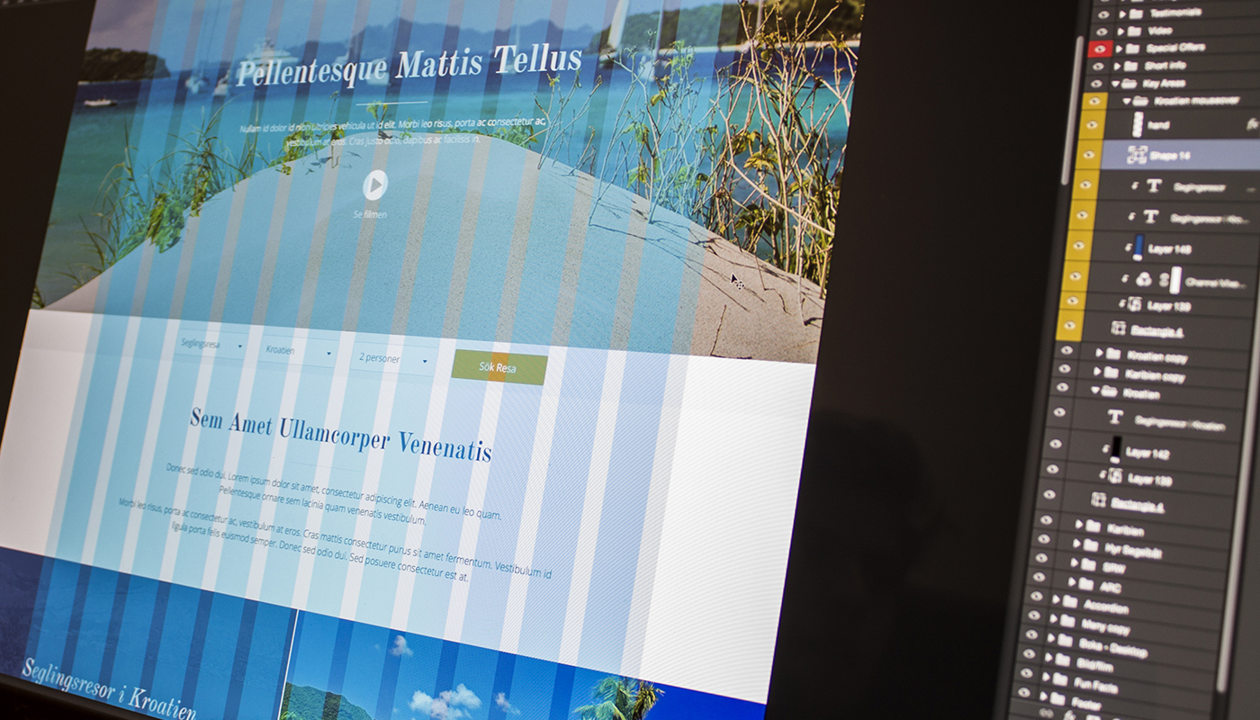
First of all let us define what it is mobile friendly site, and why it is important. Mobile-friendly sites are those sites that are optimized for viewing from mobile devices, and adapted for mobile devices to facilitate orientation and use. About the importance we don't need to talk that much, we will just tell you the fact that more than 60% of searches coming from mobile devices.
Websites that are optimized for mobile devices will be better positioned when searching, than those that don't.
Because of the many panic calls we got from our clients, we decided to clarify what exactly does mobilegeddon changes. The main fears our clients had were; will my site still be visible on Google search, whether my site will be able to find at all, will it disappear from search engines, etc.
So for all those who didn't thought on time about the growing trend of using mobile phones, we have good news. Your site will not disappear, nor will it Google completely throw it out.
What changes is that all websites that are optimized for mobile devices will be better positioned when searching from mobile devices than those that do not. Which means, exclusively for searches on mobile phones, mobile-friendly sites will have an advantage over the others, but that does not change the situation for searches from your computer or tablet.
It is important to emphasize that this is only one of the parameters that Google takes into account so you still need to think primarily in high-quality and relevant content and items of SEO we have already talked about.
Nevertheless, the use of mobile phones will certainly not decrease and the search from mobile devices will only increase as one word means-if you did not, customize your page mobile devices as soon as possible!!
The main items that indicate the mobile-friendly site include:
• readable text without using zoom,
• the text adjusts to the screen so the user does not have to walk around to read it,
• links are far apart enough to give the user no problems to click on what they want,
• website without software which is not common on mobile devices such as Flash.
For certain you don't want that because of these small items that require little effort, your user switch to a competitive site just because it was easier to get the desired information from their website!